Right away, in case you’re living under a rock: music is not just about music. It’s almost not about music at all, which sounds weird i know, but totally right, most of the times.
Even the most TRUE and DIY bands would agree that merch and, in today’s music industry and scenes, social media posts and presence are the main features that can let an artist be known and get in touch with his audience or a newer one.
In this short article we will analize just a little component of what a band should do or produce in order to expand his artistic influence and reach: T-Shirt Designs.
We’ll play a little game to see how i think the process to expand the meaning and the soul of what you write through your merchandise. So we’re talking about coherence between what is visual and what is musical, we will focus only on a particular kind of design.
Here’s the scenario:
- Your band plays aggressive music
- Your last concept revolves around something horrorific and scary, fairly common througout aggressive genres of music, let’s say something along the lines of nightmares, sleep paralysis demons and stuff like that
- Your budget is modest (this point is quite interesting to include since the merch should and has to be thought and created consequently)
Firts Step: What kind of merch should i choose?
The answer isn’t as easy as it seems, well, we have to take in consideration some factors here.
The item choice is obviously a T-shirt. They’re generally cheaper and more common as a item to wear. I would personally avoid, a the first item of merchandising of your project, tank tops or shorts or items that are too uncommon or specific to appeal to everybody.
Ok, t-shirt, but what color? That’s an important question you should ask yourself because it may determine the use of your budget, here’s why:
A plain white tee (see what i did there?) is ofter cheaper and can be perfect even for digital prints with colors but its appeal may be lower since it’s not something you common punk rocker or metalhead would wear. Lower cost but lower appeal, take in consideration that.
Colored shirts are a gambling game. You may find out that for some reason your audience LOVES green shirts so with your ninja-turtle-like shirt you it the jackpot. Let’s be honest, it’s rare. I wouldn’t consider this an option as your first merch item. It can be a great addition later but we’re trying to stary safe and optimize budget.
So yeah, a black t-shirt is the “obvious” choice, the safest at least, nothing cutting edge but nonetheless solid.
Second Step: What kind of print should i choose?
This might be a tough technical topic but it really comes down to two choices: digital or serigraphic.
Digital prints are way cheaper, often you can order even a single item with this kind of printing technique on but it can easily fade out faster and colors are not as intense and powerfull as a serigraphic print.
So yeah, serigraphic printing has its costs and often companies set a minimum number of items you have to purchase. But it’s worth it. Colors and durability are way better and a product that can pass the test of time is what you are looking for.
Third Step: the hard choice of a design
This is the worst man, you have 37368 ideas and you have the budget for just one to be realized. Our black t-shirt needs something piercing, coherent and cool enough to push people to buy it. Let’s be real, the choice of the design is a personal thing that the members of the project should discuss and come up with together since it’s something strictly related to the music.
But since we are playing this little game and we’re trying to come up something that could represent faithfully a nightmare/sleeping paralysis demons concept i’m gonna make all the reasonings needed.
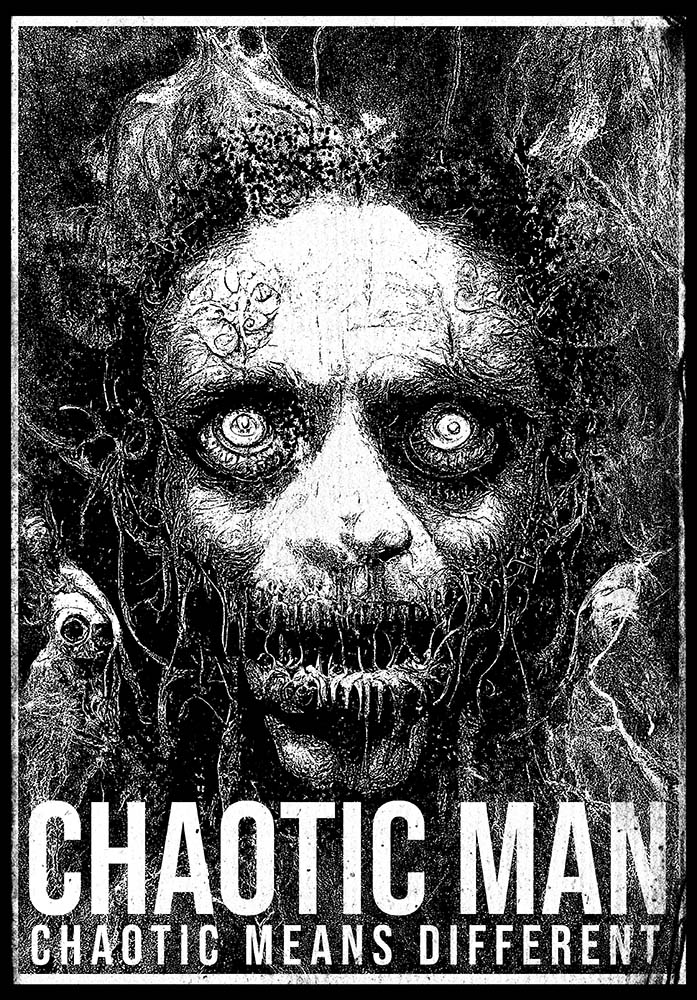
We need something eye catching and horrorific, scary and eerie. Evolution, in this case, comes up to us and helps us achieve that eye cathing thing i said just now: our brain is hardwired to recognize faces and eyes and focus our attention, even subconciously, at it. That’s pretty cool (See more HERE if you don’t believe me, it’s called Pareidolia). So a face. An ugly, terrifying and hellish face.
Fourth Step: colors and a little cheat
That’s pretty straight forward: more colors = more money.
High contrast is advised, black on white, white on black etc etc. Low contrast colors might not come out as strong as you want to.
I would avoid multiple colors since they can be a real heavy boost for the costs.
You might say: “but dude, i want shadows and a certain dimention in my design, a darker grey with a white design is mandatory”
And here’s the part you can cheat and i love it, it’s so simple yet so effective. You can cheat shadows by using dots and progressivly smaller particles in different density to create the illusion of shades and shadows (look at the final result down here, that’s something i love doing).
Final result: pretty cool stuff
So that’s the end of this game to help you figure out the best practises to approach merchandise and all the choices around it.
This is my final result, a pretty gnarly design that combines cool design ideas, technical features and budget management, all in one pretty sick design.
FYI: This design is for sale ;)


