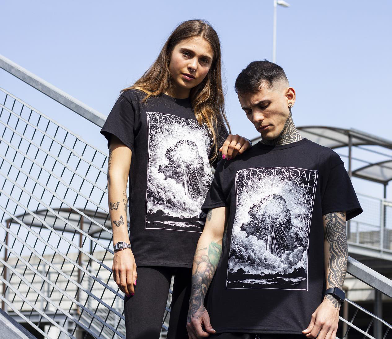
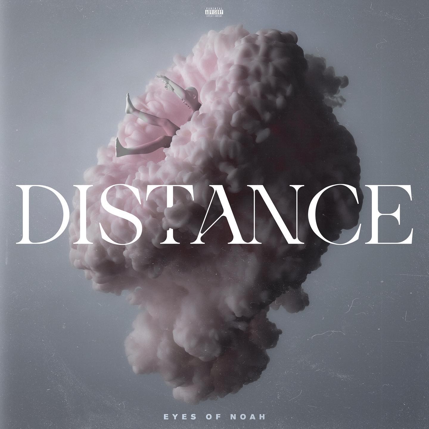
In the last few months I’ve been asked to create a T-shirt design for Udine’s finest Eyes of Noah, a Metalcore band with a new EP called Distance that just came out on May 15th. The shirt was commisioned to “celebrate” and be part of the Distance Ep as official merchandise so yeah, it had to be coherent and fit the Ep’s esthetics of course, nothing extremely “out there” or excessively different in the vibes it had to give out.
So, let’s talk about these vibes: Distance is a well balance mixture of groovy metalcore heaviness and melodic sensibility (I’ve talked about this in the EP review right HERE), so a gory or a neon monster designs could have been terrible choices. So where should we start from? My personal answer is: The Artwork. It’s not lazyness I swear, I would say that’s the right approach to extend the media, let it leak everywhere possible and make everything surrounding it fit the theme.
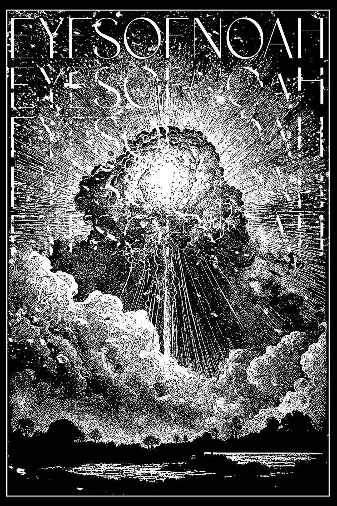
The artwork is a soft, dreamy but still kinda “dangerous” and chaotic illustration with a cloud as the main subject. So my mind went in this direction: something majestic, explosive but still pleasant with either a abstract or “cloudy” subject. This made me think about those late ‘800 painters who, obviously, painted those incredible landscapes of volcanos, sea storms and thunderstorms, following the concept of “sublime“, something so majestic, huge and powerfull that makes you feel small, powerless, in awe of its beauty. So i wanted to do that, create that sense of “greatness” and violent but still fascinating beauty.
So how I came out with this suuuuper fresh design? With those premises I wanted to try something different, use AI generated images to give a structural start. Sounds like cheating for all of you cool and hip designers out there but 1) i used it just to create the more “chaotic” and surreal subject 2) I don’t care as far as it’s used with purpose, balance and with taste.
SO, i wanted the explosion-cloud-stuff to be the center of the design and surround it with glows, clouds and a landscape that featured trees, hills and whatever it helped highlight the majestic dimentions of the explosion.
So the clouds and the rays behind the explosion had been cut out from old engravings (duh) and placed together by transform them in two-colored black and white elements. The landscape, the other way, was cut out from a painting (i don’t remember by whom, tbh) by selecting just the colors from a black value and above and letting out all the more light colors. Then, obviously, i made it all black and used it to mask the other elements of the design.
I wanted to give it then a heavy contrast to make it crispy and let all the details stand out pretty much by erasing all shadings and different colors than black and white. NO GREYS ALLOWED.
The last step was the band’s name, which repeated in this way, vertically, really completes the design by becoming part of it rather than being a separate element.


