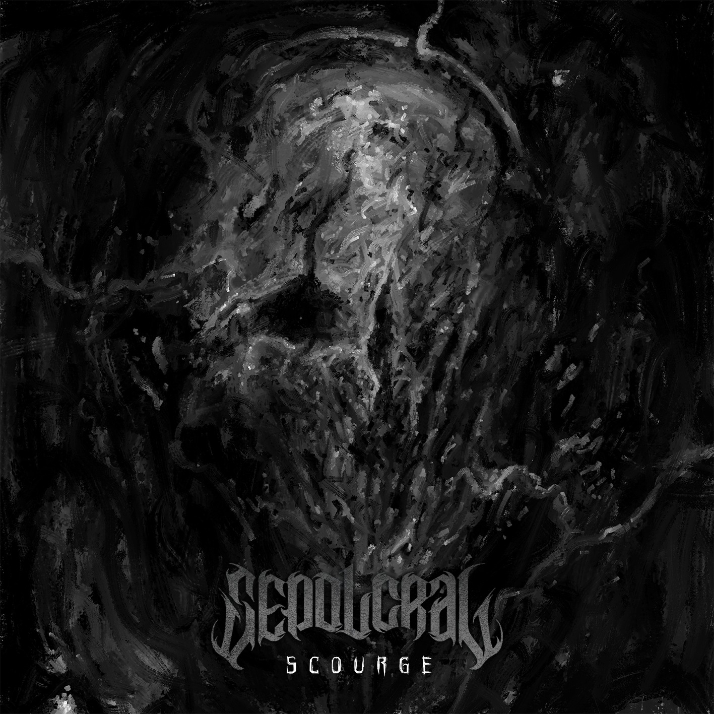
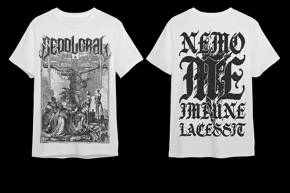
In February 2023 i had the pleasure to work with Death Metal beasts Sepolcral for two shirt designs and an extra sticker design made to promote their latest album “Scourge”. The band is active since the first 90’s and offers a classic death metal sound that flirts with grindcore and modern death metal. The task was easy: one shirt has to simply resemble the album art, the other (which we’ll check out here in a minute) is linked to a song, “Nemo Me Impune Lacessit” and feature a precise theme.
As always, i aim to create something personal, something that fits perfectly the guidelines given to me and the theme, if present, of the project and not display something distant or not coherent to it. “Scourge” is violent, heavy, relentless in its brutality from start to finish and the shirts MUST be as violent and as uncompromised as the whole album. Nothing has to be pretty, sweet or innocent.
The approach was to “extend” the song “Nemo Me Impune Lacessit” with a visual design that, at the same time, has to be created to fit a shirt format and sizes, so the possibilities are surely not infinite.
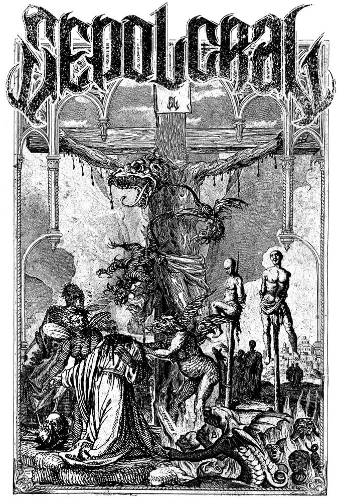
So let there be violence. The theme of this shirt had to be related to something anti-religious and blatently blasphemous, featuring something objectively obscene and offensive.
Starting from these points we have to translate the concept into images. If we have to create something blasphemous and in-your-face we have to find the perfect subject. A crucifx is the perfect starting point to develop something polar opposite to it. Se i took an old engraving of jesus and substituted his head with that of a biblical beast from another old engraving, creating this monstrous crucified demon with blood dripping from his arms. But obviously that’s not enough so i gathered multiple depictions of hell, demons and executions in an engraving like style, to fit the crucified subject, and pieced them togheter, “removing” the head of one of them, welding together multiple scenes to create this sinfull place underneath the cross, surrounded by flying demons and next to a grousome impaling scene just above an hellish pit with flames and damned souls. The balance in this kind of design is crucial. You have to make the subject pop and stick out but placing it in a cohesive way with the rest of the scene. So the demon on the cross sticks out in the middle imposing himself above the mess below him. In this way the desing, even if it’s complex and chaotic can be read and the main subject immediately recognized.
Behind the shirt we put a big writing with the name of the song in a gothic font and a big splatter behind it. This addition makes the shirt readable at 360 degrees and recognazable. The black design over a white shirt must be bold and heavy in order to be read easily and this piece of merch is very in-your-face, gritty and features all the ingredients to make a shirt stick out
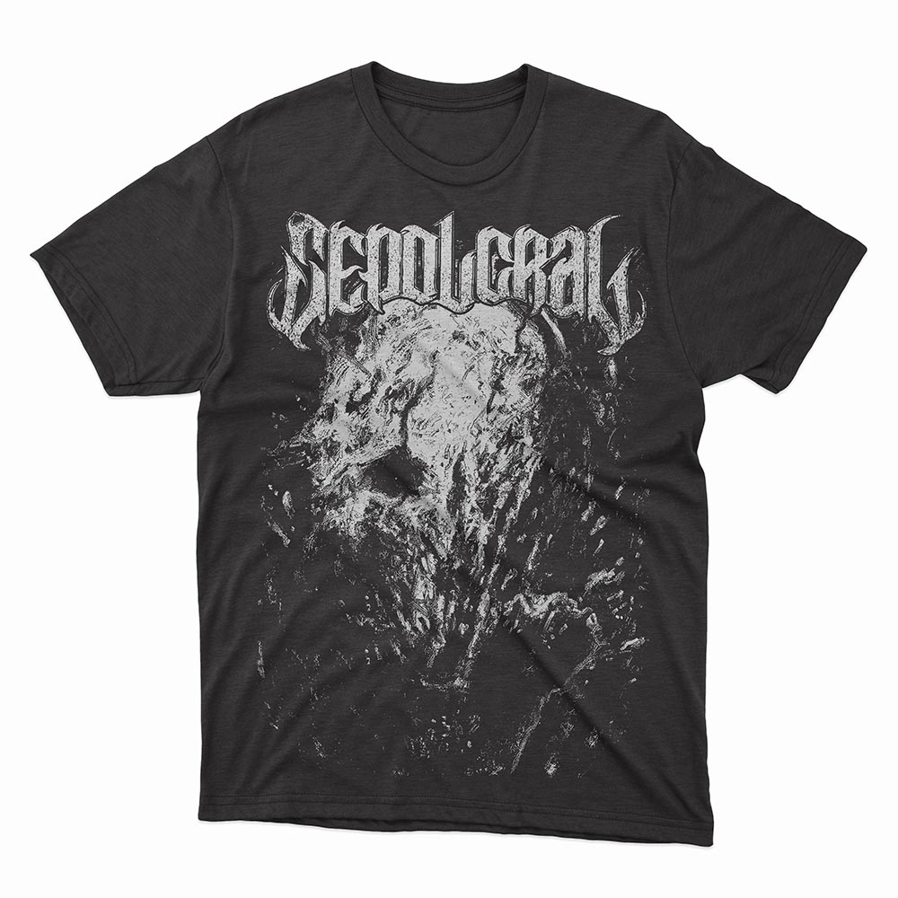
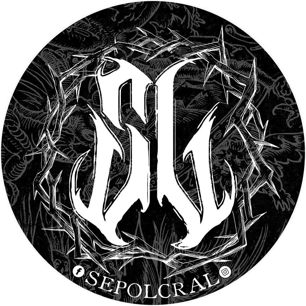
The other two designs, the black shirt and the sticker where easier to make since the subject was already defined and didn’t need the deveolpment of the concept.
So here’s both of them:
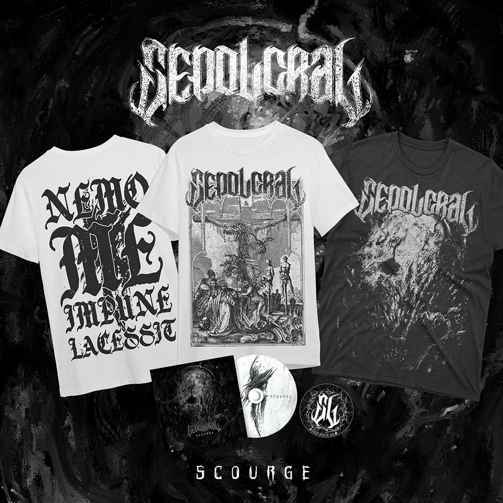
Final step: create a social media post to promote all the merch and the record. Balance is key and everything must be readable. Placing the 3 views of the shirts has being a challenge since each one of them had to be placed to make the design stick out but tilting the two on the left and right made it, like this is very balanced, pleasing to look at and the designs are perfectly in focus. The record and the sticker occupy the space below the shirts to evenly distribute the design in a way to keep the eye of the persong seing the post as relaxed as possible.
